Project Description
Smith Fire Systems is a well established company with a strong presence in the market place. Their logo is also easily recognizable and long established so they didn’t want to change it. However, there were slightly different versions being used with inconsistencies in type and color treatment. Additionally, there was no vector version of their logo which means you are limited in your use of the logo.
Project Brief
We were asked to update the type treatment – make it stronger. Establish the color palette for consistency. And build the logo in vector art. Finally, they sometimes need their logo with their tagline and sometimes without. They needed both versions available in vector art.
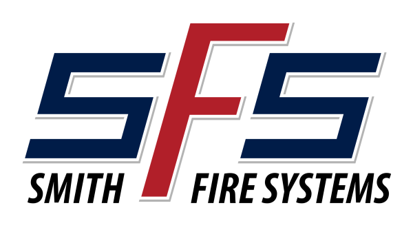
CORE LOGO UPDATES
- Logo is completely vector art. It can easily be converted to any high resolution format from this point.
- Updated typestyle for “Smith Fire Systems”. Selected a font with more style while staying traditional and has more substance which will be easier to read once reduced.
- Updated colors for a slightly richer blue and red.
- Adjusted the alignment of elements slightly for a cleaner look.
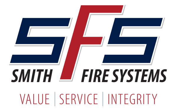
LOGO WITH TAGLINE
- Tagline font is in the same typestyle family as “Smith Fire Systems” for consistency and cohesion.
- Layout is simple but with a little more styling to stay in a more traditional look.
Some of Rules Established for Logo Usage
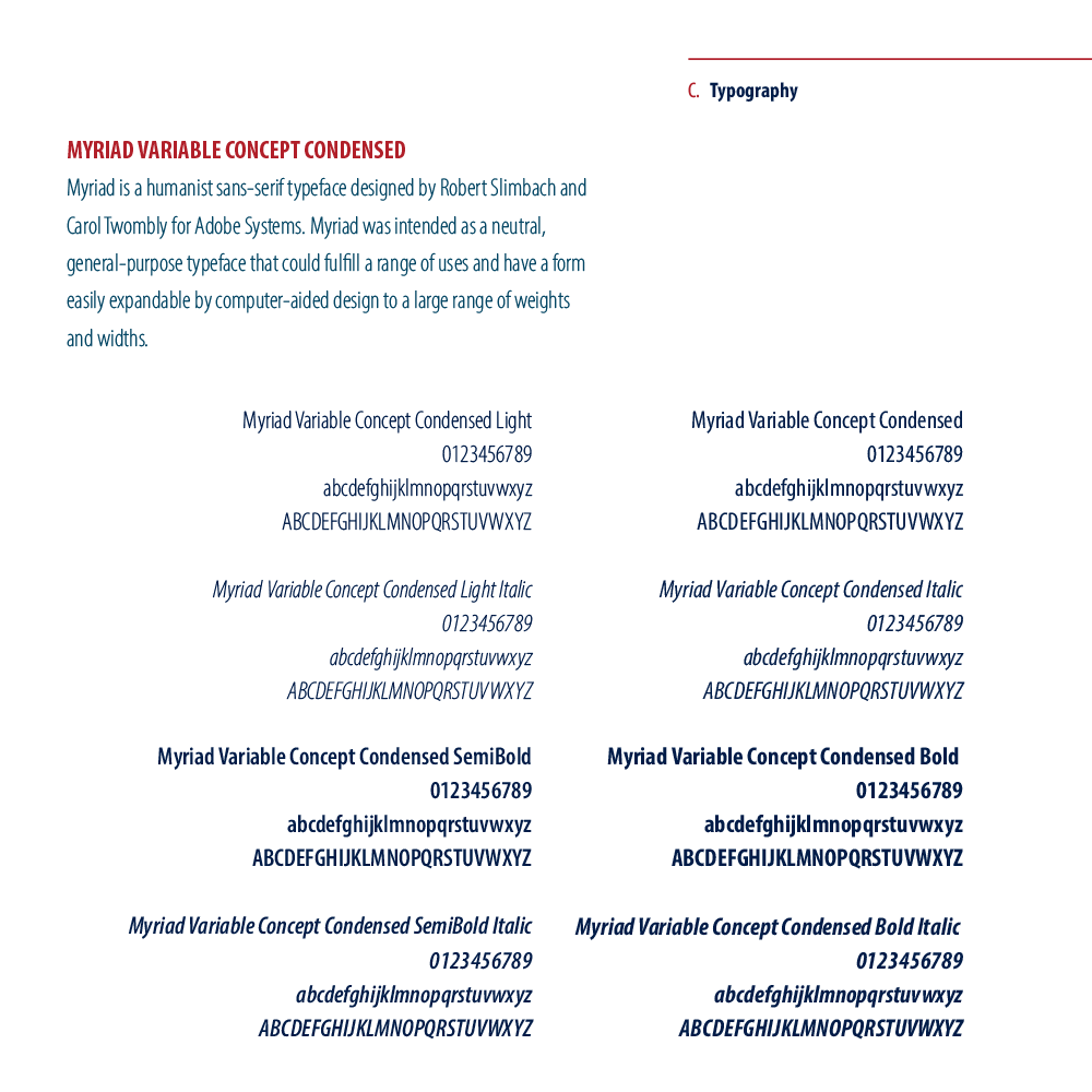
Typography Designations
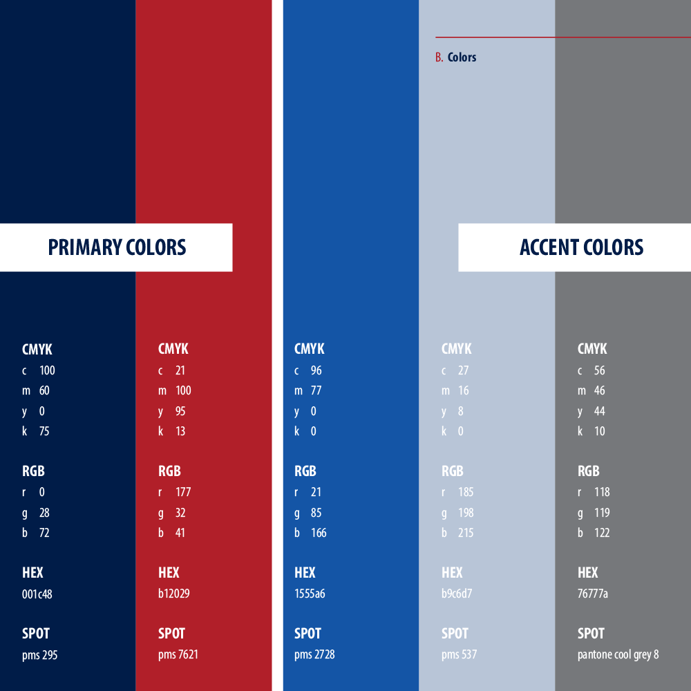
Color Designations
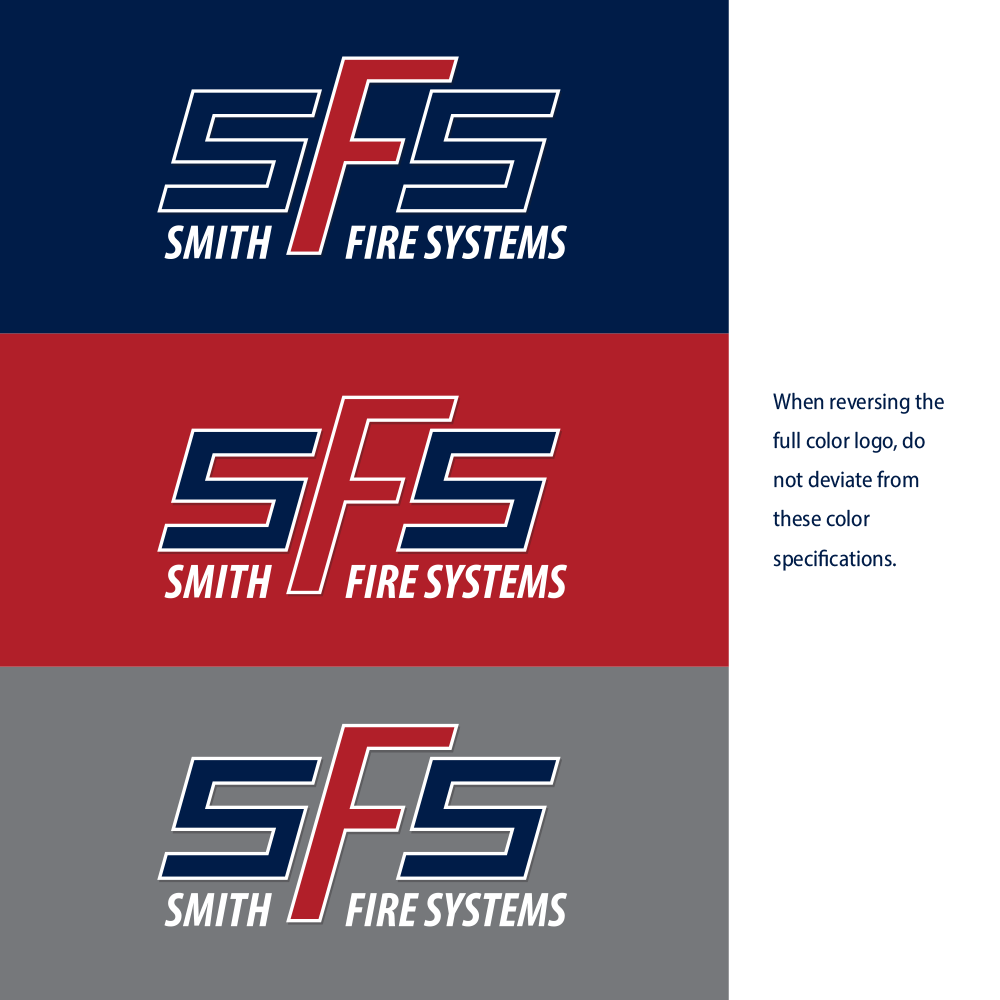
Logo Usage Rules


