Project Description

Before
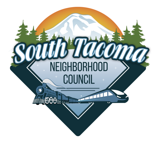
South Tacoma Neighborhood Council wanted some help updating their logo. They asked us to fix the problems they experienced with their current logo – it was an awkward size, difficult to re-color and not scaleable since it was not in vector art. They needed the tone of the logo to reflect the hard-working, blue collar, and small business demographic of the South Tacoma neighborhood.
Their neighborhood is known for Mt. Rainier, trains, and evergreen trees and they asked us to include all of them in their new logo. In approaching this logo, we knew it would be complex due to the amount of elements but we needed it to also have a warm, approachable feel. In keeping with their original logo, we created a story.
Finally, since the main logo is so complicated, we had to provide simplified versions and a vertical formats ensuring consistent logo usage over all platforms and needs. See below.
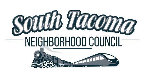
Simplified Version, 1 Color
Vertical Format, Full Color
ADDITIONAL PRODUCTS
After we completed the logo project, they requested a business card design and we managed the printing of them.


